Blue Apron Rebrand
Given the assignment to rebrand an existing successful brand, Blue Apron was the one assigned to me for this process. The first step was to identify the brand’s current branding, what works and what doesn’t. I saw that Blue Apron has never been through a rebrand since its 2012 establishment, so I had a clean slate. They also only relied on their iconic bright blue and white for their color palette.
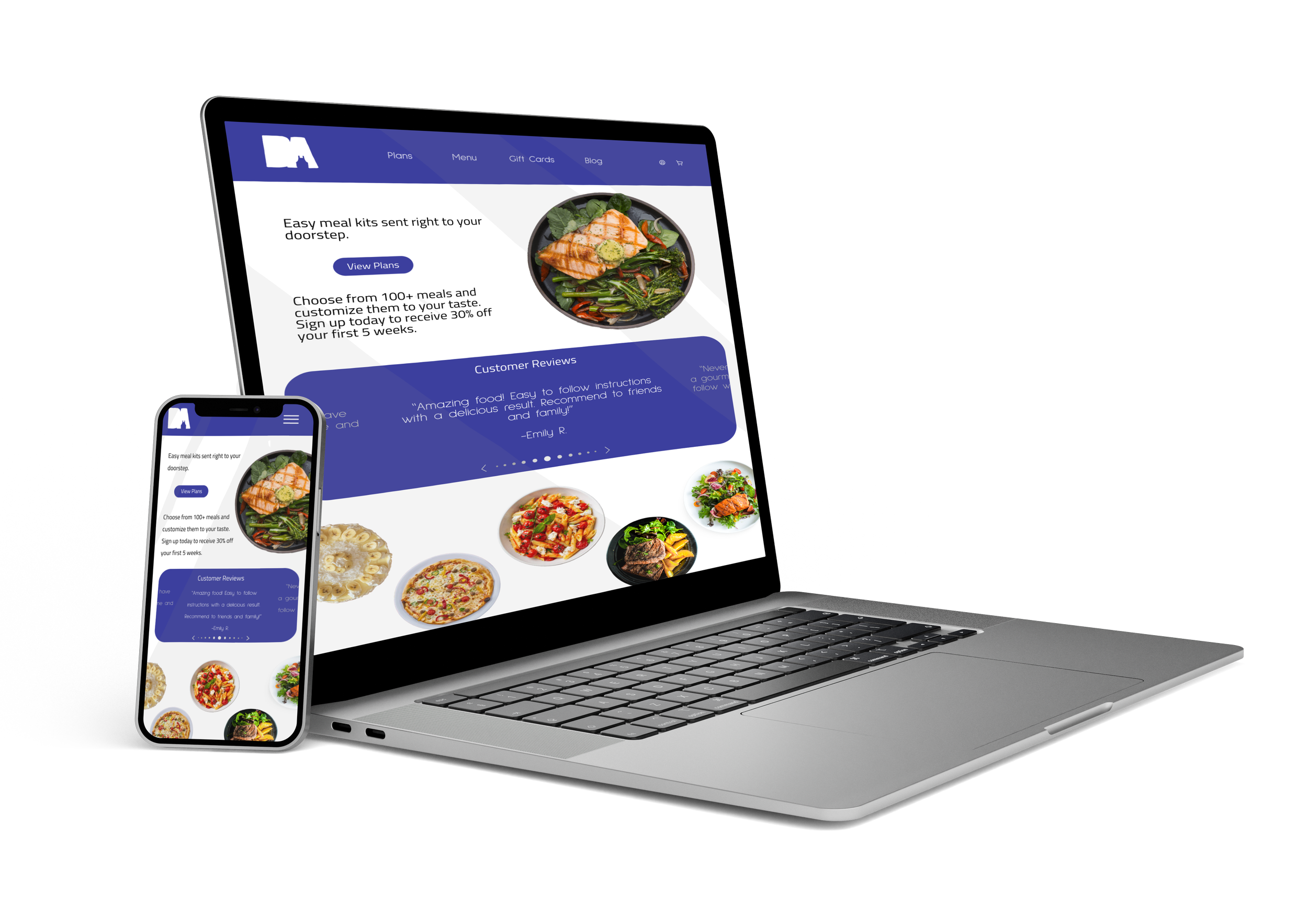
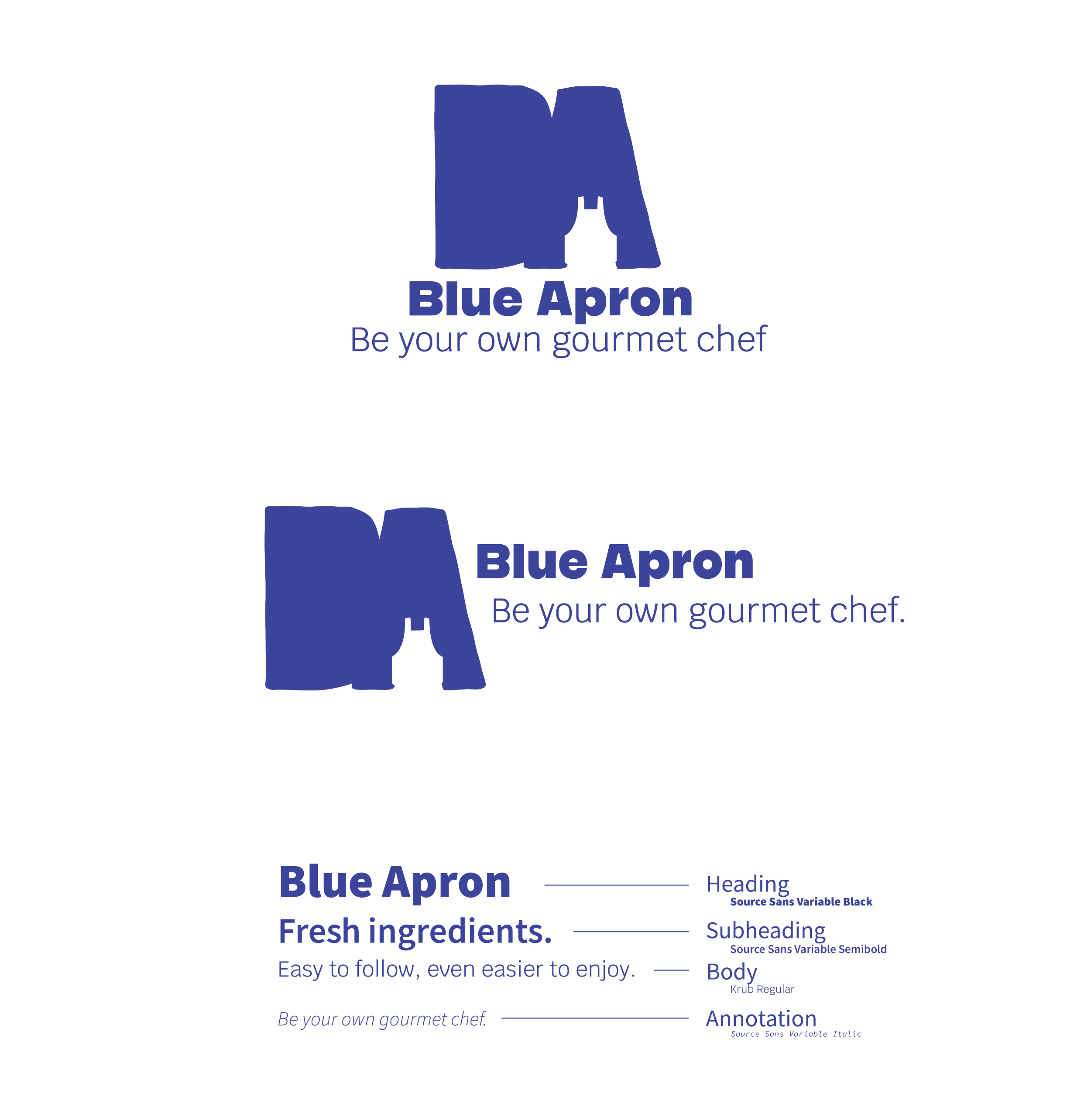
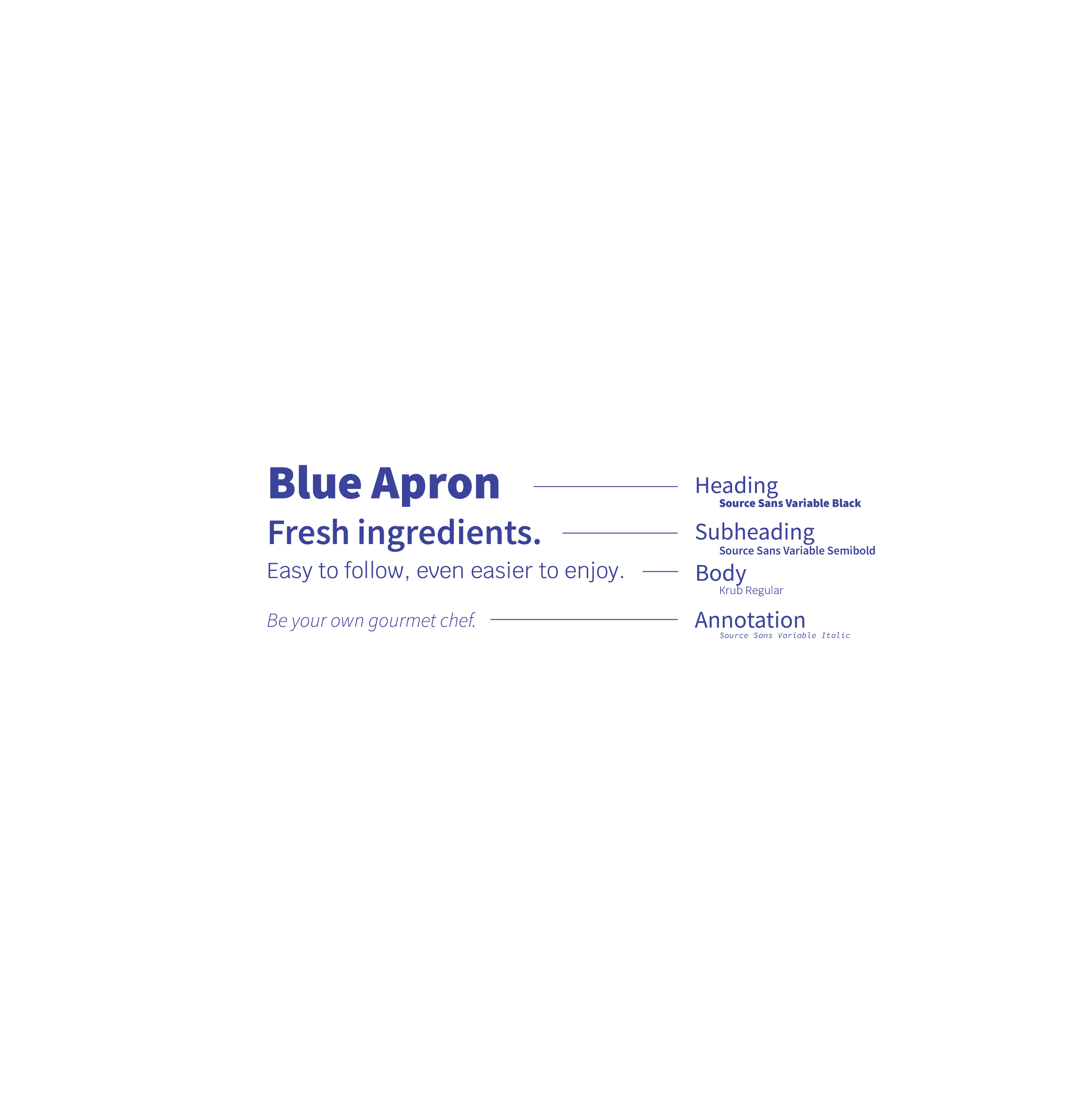
With this information, I wanted to give the brand a more modern, trendy feel with a more muted blue and other colors that complemented food products such as pale pink and green. Changing the typography was also a much in order to make the brand less corporate orientated.

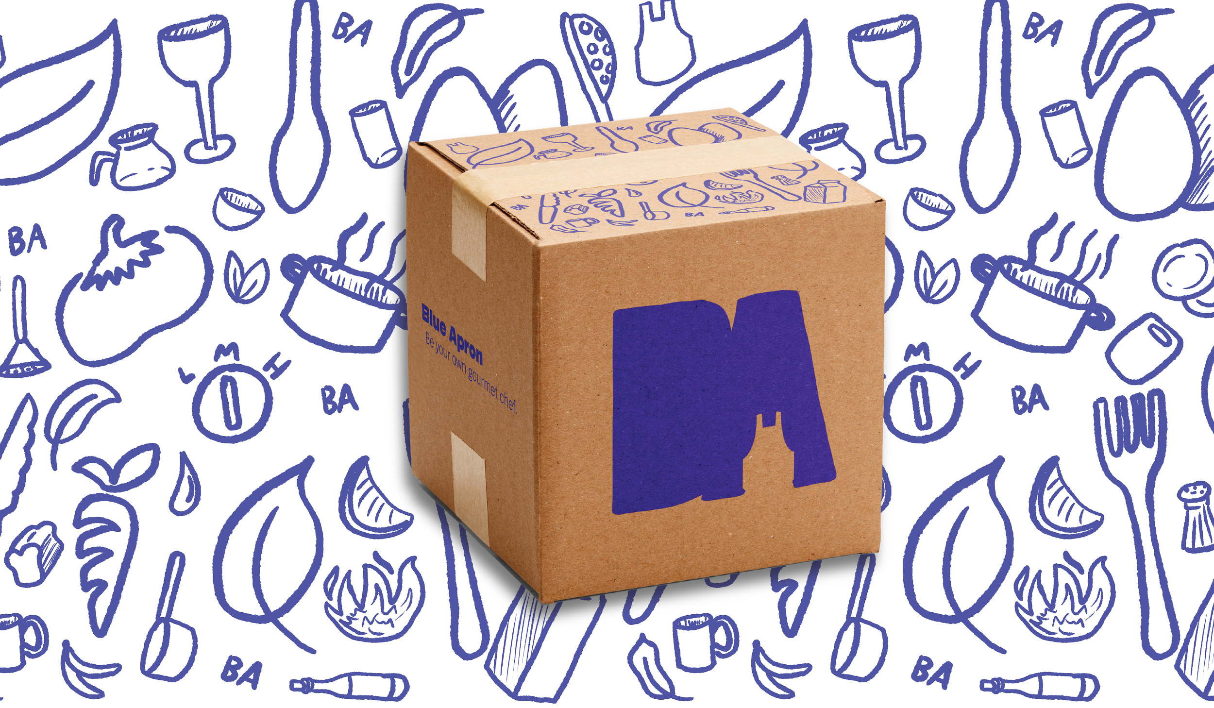
For the logo itself, I wanted to keep the iconic apron icon they currently use as a stand-alone logo, while bringing less rigidity to the new logo. I took the initials of Blue Apron, B and A, and got rid of the negative spaces within the letters, adding the apron at the bottom of the A.

The next step was to apply these branding changes to all applications the brand would use, such as a website and merchandise. In order to have food tied to the brand more, I created an illustration pattern of various Blue Apron products and food to decorate certain elements such as the box the food is delivered in.